

Check Contrast
Keep C.A.L.M. and Check Contrast
As part of our Choose Accessible Learning Materials (CALM) campaign, we are encouraging members of the university community to check the colors used in their digital resources to make sure that they provide enough contrast for people to read comfortably. As a part of university policy (and the law), we are required to meet the requirements on contrast specified in the Web Content Accessibility Guidelines 2.1 (WCAG) at the AA conformance level. These WCAG standards are there to provide specific guidance on how to make digital resources accessible to the largest number of users. Make the move to communications that are more clear and effective by checking whether your digital resources meet contrast requirements!
Why check contrast?
Fig 1. Map of Drillfield with full color vision
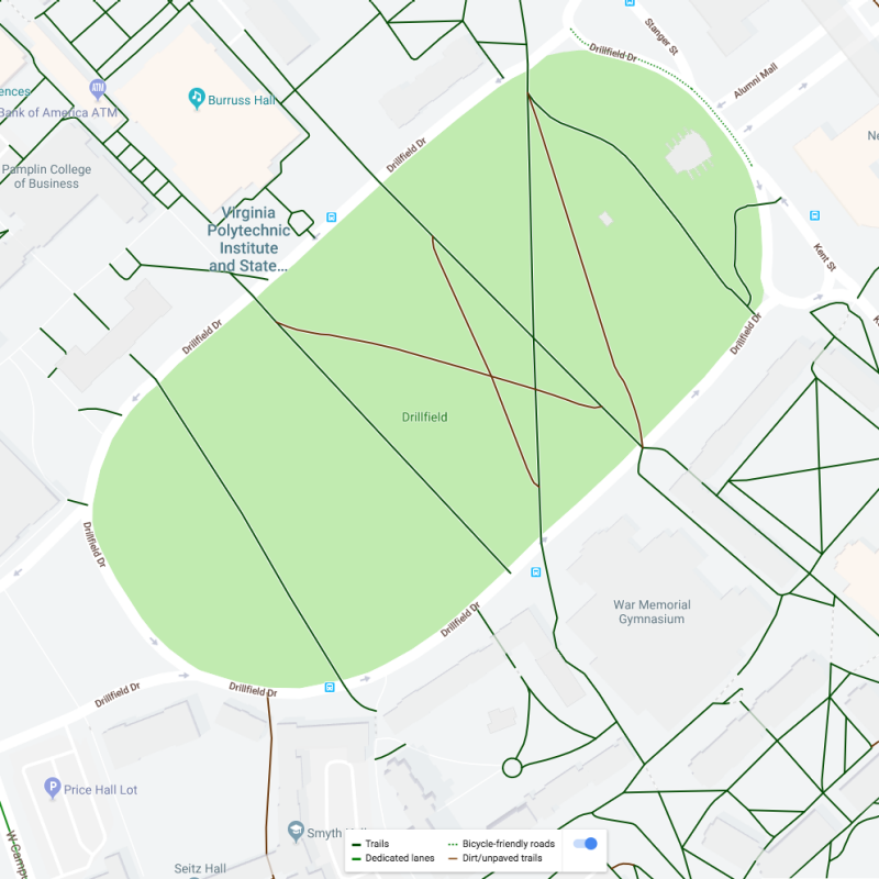
Color. We use it often. It's a way to bring focus to our communication and make our work aesthetically pleasing. But, not everyone perceives color the same way. For example, red and green color blindness is common in the United States. The different versions of the Virginia Tech campus map show that poor color can lead to information loss. This can happen due to permanent or temporary disabilities and/or situational factors.
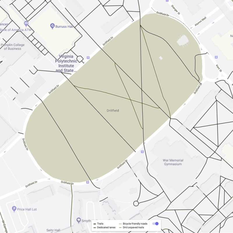
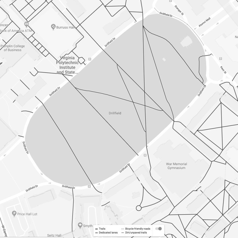
For example, information from the color map in Figure 1 is lost when one cannot distinguish between red and green, as occurs in the form of color blindness called protanopia (Figure 2). When one cannot distinguish between colors at all (Figure 3), as in the form of color-blindness called achromatopsia, even more information is lost. The National Eye Institute estimates that 8 percent of men and 0.5 percent of women with Northern European ancestry have the common form of red/green color blindness.
8 percent is almost the same number of VT students who can study in Newman Library simultaneously!
But this is not just an issue for people with disabilities. Display filters are commonly used in applications that reduce eye strain (such as F.lux, Twilight, and system brightness controls) and these can make low contrast colors less readable too. Beyond that, if you have ever tried to read from your phone in bright sunlight, you have experienced how lack of contrast can affect almost everyone at one point or another. With so many people affected, it is easy to see how failing to consider contrast can have a big effect on your ability to communicate your message.
Tell me how
But how do I know if my colors have sufficient contrast? The good news is it's not that hard. You just need to know what the requirements are and what tools you can use to help you know whether they are met.
A certain ratio of contrast between the foreground and background colors is required for different kinds of text to be readable by the largest number of people. Fortunately, you don't need to know how to calculate these ratios. Just know that once you've found out what the foreground and background colors are, you can enter those color values in any of a number of tools that will provide you with the ratio (see Figure 4 for one example).
When it comes to data visualizations, contrast can become even more critical. The contrast between the data and the background is important as well as the color palette of the data itself. Check out these examples of high contrast data and using textures.
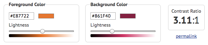
For guidance with specific tools and techniques, see Learn More, below. A couple of things are good to know right off the bat though. The required ratios are based not only on the colors, but the size and weight of the font used. Larger or bolder text needs to have less contrast in order for most users to see it. 18 point text or 14 point bold text is judged to be large enough to require a lower contrast ratio. When evaluating against the AA level of conformance then, for that larger or bolder text, the contrast ratio that must be met is at least 3:1. For text smaller or less bold than that, the contrast ratio must be at least 4.5:1. For instance, in Figures 5 through 7, below, because the font size is less than 14 points, it must meet that higher standard.
- Background Color:
- Chicago Maroon (#861F40)
- Text Color:
- Burnt Orange (#E87722)
- Text Size:
- 13.5pt
- Contrast Ratio:
- 3.11:1 Fail
- Background Color:
- Burnt Orange (#E87722)
- Text Color:
- Chicago Maroon (#861F40)
- Text Size:
- 13.5pt
- Contrast Ratio:
- 3.11:1 Fail
- Background Color:
- Chicago Maroon (#861F40)
- Text Color:
- Yardline White (#FFFFFF)
- Text Size:
- 13.5pt
- Contrast Ratio:
- 9.20:1 Pass
Learn More
Learn how to:
- Choose accessible color combinations from the university's brand palette
- Check any color combinations for contrast level
- Check contrast of colors used in Canvas
- Check contrast of colors used in Word
- Check contrast of colors used in PowerPoint
- Convert between different color value formats, like RGB to Hex
- An Incomplete Guide to Accessible Data Visualization by Nancy Organ
There are many more ways color can impact your ability to communicate your message, but getting the foreground and background color to meet minimum contrast requirements is one of the biggest ways to have an impact. To learn about some of the other things to consider and some other tools that may be useful, a good next step would be to watch episode #17 of the A11ycasts accessibility video tutorial series from Google, How to check for accessible colors.
Join the campaign
Our goal is to increase the number of Virginia Tech web pages and communications that have proper foreground/background color contrast. You can help us get there by sharing your before and after examples of high contrast with @VT_TLOS #CALMContrast or emailing screenshots to assist@vt.edu. Every entry is eligible for some of our Keep CALM swag.
Resources
- Keep CALM and Check Contrast Poster (PDF | 975 KB) for your printing pleasure.
- Keep CALM and Check Contrast Presentation (PPT | 5.1 MB) for sharing the message with your colleagues